6 Custom Badge Design Mistakes That Make Your Organization Look Unprofessional
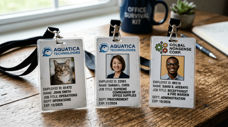
Designing a professional ID badge isn’t as simple as dropping in a name and logo. Contrast, colour, font choice, and layout all play a role — and getting any one of them wrong can undermine your brand before you’ve said a word. Here are the most common custom badge design mistakes organizations make, and exactly how to fix them.
1. Colour and Contrast Issues
Overly bright or clashing colours create visual noise that pulls attention away from the information that matters. Too many hues, colours that don’t align with your brand, or insufficient contrast between text and background can make your badge hard to read — and hard to take seriously.
Stick to high-contrast combinations: light text on a dark background, or dark text on a light one. Use colour strategically — to differentiate departments or badge types, for example — but limit your palette to two or three complementary colours that reflect your brand identity.
2. Blurry or Low-Resolution Graphics
Pixelated logos and soft graphics are one of the fastest ways to look unprofessional. For clean, crisp printing, your files should be a minimum of 300 dpi, with 600 dpi recommended. Vector formats — .eps, .ai, or .pdf — are ideal, as they scale without any loss of quality.
3. Information Overload
ID badges are small. Cramming them with excessive text, multiple logos, and decorative elements doesn’t communicate more — it communicates nothing clearly. A clean, balanced layout makes your key information more memorable and far easier to read at a glance.
If you genuinely need to include a large amount of information, double-sided printing is a smart solution. Keep the front focused on the essentials — name, title, logo — and use the back for compliance details, access codes, or secondary information.
4. Font Size and Readability Problems
Decorative, overly generic, or too-small fonts make badges difficult to read — especially at a distance. Limit yourself to two fonts maximum; any more creates visual chaos. Avoid script, handwritten, or highly stylized typefaces.
Bold, clean sans-serif fonts deliver the best clarity for ID badge use. Your most important information — name, title, company — should always be the most prominent text on the badge.
5. Logo Placement and Branding Inconsistencies
Your logo needs to work across different sizes and backgrounds. A logo that looks sharp on a website can become muddy or distorted when scaled down to badge size, especially on coloured or patterned backgrounds. Test your logo at actual print size before committing to a design.
Consistency matters here. Your badge should align with your broader brand guidelines — the same logo version, the same colour usage, and the same visual language as your other materials.
6. Overcomplicated Layouts
Too many backgrounds, patterns, or decorative elements turn an ID badge into visual clutter. When in doubt, simplify. The most important information — name, title, company — should be the most prominent elements on the card, displayed in larger, bolder type.
If a first and last name feels crowded on one line, separate them — first name prominent, last name and title on the line below. Breathing room is not wasted space; it’s what makes a badge readable.
How abc identity SOLUTIONS Corrects These Mistakes — Before They Happen
Catching design mistakes after printing is expensive. We catch them before the job ever goes to press.
600 dpi Printing, Every Time
We print at 600 dpi as standard — not as an upgrade. Your logos and graphics will be sharp, crisp, and professional, regardless of complexity. We also ensure only high-resolution source files are used so quality is never compromised at the file level.
Durable, High-Quality Materials
A great design on cheap material still looks cheap. Our badges are produced on durable stock that resists daily wear and tear, so your investment holds up over time — and continues to represent your brand the way it should.
Clean, Purposeful Layouts
We guide every client toward a clear, focused layout that puts the right information front and centre. If you have complex information requirements, we’ll recommend double-sided printing so nothing gets compromised or overcrowded.
Readable Fonts and Smart Colour Choices
Our design team selects fonts and colour combinations that maximize legibility and align with your brand — not just what looks good on screen, but what prints cleanly and reads clearly in real-world conditions.
Print Testing Before Full Production
Before we produce a full run, we offer print tests that verify alignment, readability, and colour accuracy. You can request one at any stage of the design process. It’s a simple step that eliminates costly surprises and ensures the final product matches your expectations exactly.